The Art of Engineering
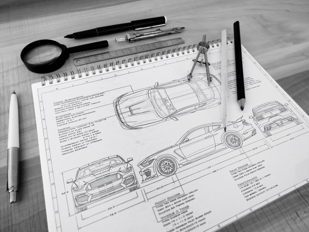
Before starting any project – I first have to discover the intent behind the piece. I genuinely mean ‘discover’, as this happens long before even I know what car, or setting, I am going to be illustrating. The route of discovery involves understanding what it is, exactly, that you want to portray in your illustration – what is the sole intention behind the piece and what purpose does it serve? In other words, what is your illustration trying to say and why is your artistic depiction of that message, given what you currently know and have learned, the ‘best’ way of getting that particular idea across to your given audience?
“The route towards artistic discovery is the same regardless if you’re creating a race car or a poster for someone’s bedroom wall.”

This is the question – that must be answered whenever I consider getting involved with any work, whether it’s engineering design or creating a print for a client. The route towards artistic discovery is the same regardless if you’re creating a race car or a poster for someone’s bedroom wall. What purpose does this illustration serve – and how has this purpose influenced your design decisions? If you’re able to answer this question, then you are ready to begin sketching your ideas and ultimately bringing them to life.
The Function is the Form
Good design – is much like a good book. When executed properly, everything should serve the story; including the characters, motifs, and the plot. If an element in the book doesn’t satisfy the storytelling, then it merely satisfies itself at the expense of the storytelling – and thus at the expense of the book’s ideal incarnation. Good design works the same way and when practiced is often compared to mastering a language, drawing itself closer to its goal of serving a greater purpose in itself. The better use of the design language, the clearer this observation manifests. If you’ve ever looked at a car and solely from the design have been able to draw some conclusions on how it drives, what the car was intended for, how it sounds and the sort of person you think this machine was most likely catered for – what you’re witnessing is the product of good design and a proper use of the language.

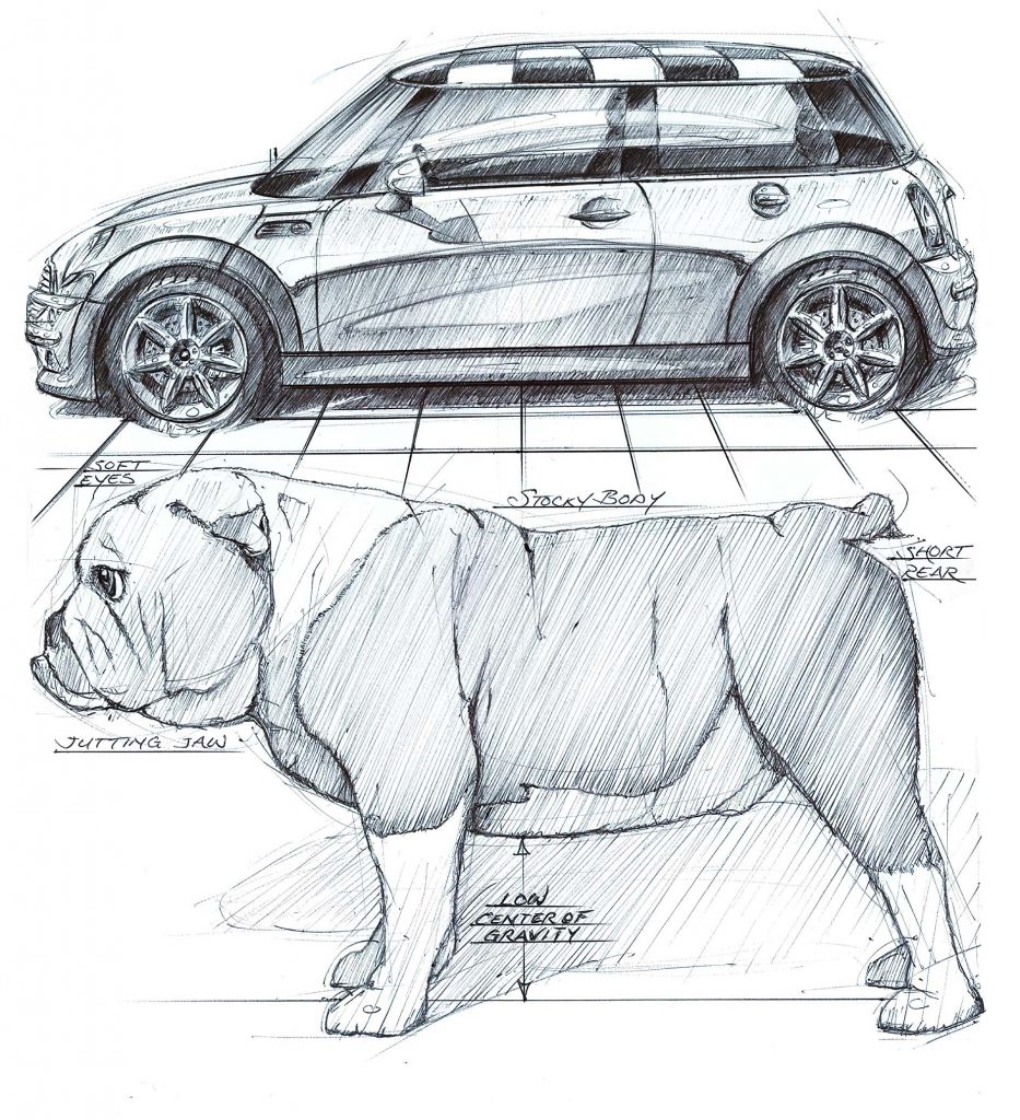
What, you thought it was pure coincidence that the Mini looks like an English Bulldog?
“The MINI and the British Bulldog – power in a small package, attitude beyond size! My inspiration for the design of the New MINI was the British bulldog. It’s an English icon, positively quirky and it has that low and wide stance with a tugging at the leash feel, the perfect influence!”
– Frank Stephenson, Automotive Designer
Art inspired by nature – is by no means a new trope, or some sort of industry secret. It is why modern hypercars all look like marine animals, almost shark-like, drawing attention to their sleek aero-package as the design language illustrates their various capabilities of carving through air like fish in a stream. Nature, in itself, is also a product of function. The evolutionary history of the animal kingdom is a fantastic example of how ‘designs’ change to fit the need of the the animal [the product]. Look more closely and you’ll also see how the outcome of nature’s alterations to biology shapes our depiction of nature itself – how the bear is the symbolic ambassador for nurture and love, while also representing brute strength and deadly instincts. Surely you would never want your child sleeping next to a real bear, would you? The underlying ethos of your design should be clearly communicated through your use of the language, so much so that people can discern the differences between the cuddly bear and the one that’ll rip your limbs off. This is, in part, what makes homologation examples really interesting – the opportunity to engage with the animal, without the fatal context of it trying to kill you.
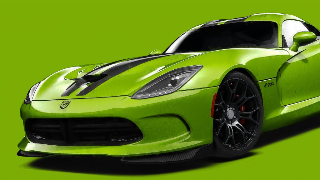
Unless it’s a Dodge Viper – those will try to kill you regardless.


Understanding Language – the What, Why and How
When you look at a car – pay close attention to how you visually interpret its design. Let’s pretend you’re shopping for a new car. You drive down to your local Chevy dealer, and after fending off the sales people with a yard stick, you find yourself browsing the lot. You walk past the line of automobiles, all eager to be chosen as ‘the one for you’, and your eyes ride over their rooflines like a strong wind turning pages over in a book – eventually, the words all start to get really blurry and the story starts to lose its meaning. But then, piercing through the mediocracy is a bright red Corvette Z06 – why it looks just like the one those IMSA lads use on the track! Suddenly the wind stops and your eyes catch the page in the book that is made up of only two words, one on each page, in bold font and all caps – DRIVE ME.
This little red corvette is a bit naughty, and you like naughty. But how do you know that?
Because the car’s design is making that message explicitly clear to you. It’s seducing you by advertising what it wants you to do the moment you step inside. It’s the ‘woman in the red dress’ from the Matrix training program. It knows what it’s doing by giving you that look – and you know it, too.

Interpreting design – is something we’re all capable of doing. A large part of this is because of the very nature of the language we discussed earlier, drawing inspiration from the elements of our natural world that have influenced our evolution throughout our lifetime on this planet. But if you were to carefully, and somewhat arbitrarily, break down what’s actually going on, what you’re really doing is analyzing what something is, why it is that way, and how that something is used (or if it’s of any utility to you at all). And if it seems like I’m drawing a conclusion between design and purpose, that’s because this is exactly how your brain interprets objects in the world. You gauge them by their utility, and the more relevant the utility is to you, the higher you value that thing. That same Corvette, with all of the same features, might not have the same effect on someone who does not find those qualities quite as useful – and thus the car itself becomes less valuable to them. So in order to understand how to orient your design, you first have to understand what it is you’re designing exactly, why certain things matter more than others and how you’re going to emphasize the utility of those things to your respective audience.
This concludes part one of this series, but there will be more to come.
Please share your feedback – it would mean a lot to me and helps me write and organize these posts better. Thank you
